5 Colors I’d Skip After 50 (and What Works Better)
Have you ever put on your favorite blouse or sweater, looked in the mirror, and felt an unexpected wave of disappointment? The outfit fits. The style is…

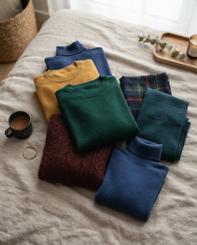
Black used to be my default. Work meetings, dinners, doctor’s appointments: black, every time, because it felt safe. Then a friend took one look at me in it a few years ago and said I looked exhausted. She was right, and it had nothing to do with how much sleep I’d gotten.
Jump to section
Color changes how light bounces off your face, and that matters more as your natural coloring softens with age. Some shades wake your skin up. Others sit there and drain it. None of this means overhauling your closet, just being a little more deliberate about what goes near your face. Here are five colors that tend to work against you after 50, and what to reach for instead.
1. Black, right at the neckline
Black is classic for a reason: it’s slimming, it goes with everything, it never looks wrong on paper. Worn close to the face, though, it can be unforgiving. As skin tone softens, flat black next to it tends to deepen shadows under the eyes and along fine lines instead of framing the face the way it does on younger, higher-contrast skin.
You don’t have to give it up. Wear it below the neck: pants, skirts, shoes, and keep it away from your face. A soft scarf in ivory, blush, or camel near the collar undoes most of the damage. Textured black (a bouclé, a slubby knit) also reads softer than flat matte black.
2. Very dark navy
Navy gets sold as the gentler alternative to black, and mostly it is, until it’s dark enough to basically read as black anyway. Under office lighting especially, a flat, near-black navy absorbs more than it reflects, and the effect on your face is the same as black: less lift, not more.
Royal blue, indigo, cobalt, or peacock blue give you the same put-together feeling with far more brightness bounced back at your skin. They tend to make the whites of your eyes look brighter too, which black and navy just don’t do.
3. Pastels that are too close to your own skin tone
Pale pink, powder blue, soft lavender: pretty on a hanger, and I understand the appeal. The problem is contrast. When a color sits too close to your natural skin tone, it erases the line between your face and your collar instead of framing it, and the result reads as tired rather than fresh.
Richer versions of the same colors solve this. Raspberry instead of pale pink. A real sky blue instead of dusty powder blue. Or keep the pale pastel below the waist and put something with more depth near your face.
4. Khaki
Khaki is the one on this list I have the least patience for, personally. It’s practical and it photographs fine on a rack, but that gray-yellow undertone tends to pull the same murkiness out of skin that it’s supposed to complement. On most people it just looks tired next to tired.
Warm olive, emerald, or forest green keep the same grounded, easy-to-wear feeling without the flatness. They’re close enough to khaki in spirit that you won’t feel like you’re wearing a different person’s wardrobe.
5. Neon, worn head to toe
Nothing wrong with neon. The mistake is wearing it right at the face, where the contrast is so sharp it drags the eye straight to whatever you’d rather it not notice: fine lines, shadows, whatever you’re self-conscious about that week.
Keep it to a bag, shoes, or a scarf tied loosely enough to stay a few inches from your jaw. Or reach for a slightly muted version of the same color and let it do its job from a little further away.
The actual test
Forget rules for a second and just hold the item up in daylight — not the overhead bathroom light, which flatters nobody. Does your face look brighter or duller? More rested or less? That’s the whole test, and it works better than any list, including this one.
For what it’s worth, the colors that keep coming back into my closet are warm neutrals (camel, taupe, soft gray), deeper jewel tones (teal, plum, burgundy), and a warm ivory instead of stark white. They do the same job black used to, without the toll.
Style doesn’t have an expiration date, and none of this is about hiding your age. It’s just easier to look like yourself, awake, in some colors than others. Once you notice which ones do that for you, the rest of the list stops mattering much.